Software > Parallel Coordinate Visualization
Description | Pros and Cons | Applications | Details | Usage Hints | References | Acknowledgments| Description |
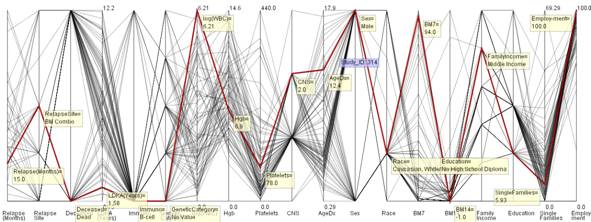
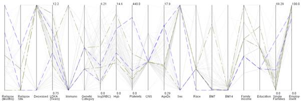
Parallel coordinate visualization is used to represent high dimensional data in two-dimensional space. In the visualization, all the data dimensions are represented as equidistant vertical axes that are arranged parallel to each other [1]. Each data entry is shown by a single line that traverses through all the vertical axes. This data entry line intersects each axis at a point depending upon its data value along that axis. In the figure below, the data entry identified with study id of 134 is highlighted in red. To add a new data dimension, a new data axis has to be introduced to the visualization.
Typically the parallel coordinate system is used to represent numerical variables. But the parallel coordinate view can be optimized to show numerical as well as categorical data values as shown in the diagram below.
| Pros & Cons |
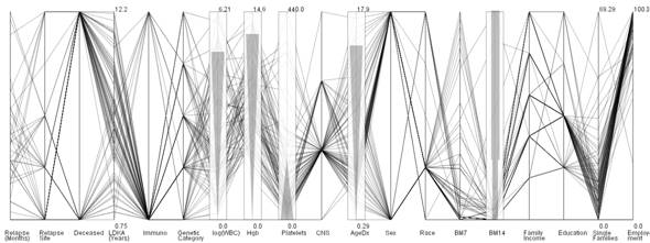
The main advantage offered by parallel coordinate is the representation of high dimensional data as a 2-dimensional visualization. As data is represented in the form of a line, it becomes easy to perceive the trend shown by data entries from the visualization. The axes order can be changed to check out the trend between two different axes. The only disadvantage seen is the overlaying of data lines for common data values among data entries. However, this issue can be addressed to a certain degree by changing the axes order in the visualization.
| Applications |
The parallel coordinate visualization can be used to visualize any kind of data where one needs to see the correlation between different variables of the data. For example,
- Clinical trial data to identify the correlation between different patient groups
- Stock market data variables
| Details |
The basic code for parallel coordinate visualization was obtained from an open source project called ParVis [2]. The original code permits to visualize numerical data. The code was modified to deal with both numerical and categorical data [3]. The modified code is available as a part of the NetworkWorkBench (NWB) project. A demo of the parallel coordinate visualization is integrated as a plugin for CIShell.
An illustration of different features is given below.
1. Highlight single data entry

2. Tool-tip display to show the data values of the selected line
3. Display axes-labels to mark different regions/values along axes

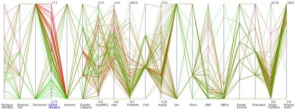
4. Display zones to show severity values
5. Axis selection to study global variations
6. Select and categorize data records as a group
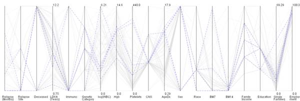
7. Simultaneously display data records to study their variation
Group I
Group II

Group I & II together
| Usage Hints |
The parallel coordinate visualization is integrated as a demo tool in the CIShell toolkit. The visualization can be viewed by following the instructions below,
- Start the CI-Shell toolkit application
- From the main menu, click and choose File > Dataset >Parallel coordinate STF File
- When the dataset is loaded, click and choose Visualization > Parallel coordinate visualization
| References |
1. Inselberg, A. and B. Dimsdale (1990) Parallel coordinates: a tool for visualizing multi-dimensional geometry, Proceedings of the First IEEE Conference on Visualization, pp. 361-378, San Francisco, CA
2. ParVis project: http://home.subnet.at/flo/mv/parvis/
3. Mane. K. K. (2006), Envisioning Knowledge: Tightly Coupling Knowledge Analysis and Visualization, Doctoral Dissertation, Indiana University, Bloomington.
| Acknowledgments |
This documentation was compiled by Ketan Mane and Katy Börner. Bruce Heer helped with the integration of the code with the CI-Shell toolkit.
![]()
Information Visualization Cyberinfrastructure
@ SLIS, Indiana University
Last Modified January 14, 2004